Guide For Micro-Frontends
Module Federation
Shared
The shared configuration is used to share common dependencies between consumers and producers, reducing the runtime download volume and thus improving performance. shared allows you to configure rules for reusing dependency versions.
- Type:
PluginSharedOptions - Required: No
- Default:
undefined
The PluginSharedOptions type is as follows:
type PluginSharedOptions = string[] | SharedObject;

interface SharedObject {
  [sharedName: string]: SharedConfig;
}

interface SharedConfig {
  singleton?: boolean;
  requiredVersion?: string;
  eager?: boolean;
  shareScope?: string;
}
- Example
new ModuleFederationPlugin({
  name: '@demo/host',
  shared: {
    react: {
      singleton: true,
    },
    'react-dom': {
      singleton: true,
    },
  },
  //...
});
Singleton
- Type:
boolean - Required: No
- Default:
false
Whether to allow only one version of the shared module within the shared scope (singleton mode).
- If singleton mode is enabled, the shared dependencies between the remote application components and the host application will only be loaded once, and a higher version will be loaded if the versions are inconsistent. A warning will be given for the party with the lower version.
- If singleton mode is not enabled, and the shared dependencies between the remote application and the host application have different versions, each will load their own dependencies.
RequiredVersion
- Type:
string - Required: No
- Default:
require('project/package.json')[devDeps | dep]['depName']
The required version, which can be a version range. The default value is the current application's dependency version.
- When using shared dependencies, it will check whether the dependency version listed in the
package.jsonis greater than or equal torequiredVersion. - If it is, it will be used normally. If it is less than
requiredVersion, a warning will be given in the console, and the smallest version available in the shared dependencies will be used. - When one party sets
requiredVersionand the other sets singleton, the dependency withrequiredVersionwill be loaded, and the singleton party will directly use the dependency withrequiredVersion, regardless of the version.
Implementation with Vite
Vite Module Federation using @module-federation/vite (modern way)
Install @module-federation/vite:
pnpm add @module-federation/vite
In your host, import it and use like so:
import { defineConfig } from 'vite';
import { federation } from '@module-federation/vite';
import react from '@vitejs/plugin-react-swc';

export default defineConfig({
  plugins: [
    react(),
    federation({
      name: 'host',
      filename: 'remoteEntry.js',
      remotes: {
        // Note about the key for the object (i.e. '@mf-books'), it can be whatever you want. with this you'll do the import. i.e. '@mf-books/SomeComponent'
        '@mf-books': {
          name: '@mf-books', // <--- this needs to match the EXACT name of the remote MF.
          type: 'module', // <--- IMPORTANT!!! without this you'll get an error. Your remote vite apps are bundled as esm.
          entry: 'http://localhost:3001/remoteEntry.js',
        },
      },
      shared: ['react', 'react-dom'],
    }),
  ],
  build: {
    modulePreload: false,
    target: 'esnext', // <--- or 'chrome89' , just as long as you have top-level-await in the runtime environment it's fine.
    minify: false,
    cssCodeSplit: false,
    sourcemap: true,
  },
});
In your remote, import it and use it like so:
import { defineConfig } from 'vite';
import { federation } from '@module-federation/vite';
import react from '@vitejs/plugin-react-swc';

export default defineConfig({
  plugins: [
    react(),
    federation({
      name: '@mf-books',
      filename: 'remoteEntry.js',
      exposes: {
        './App': './src/exposes/ExposedBooksMF',
      },
      shared: ['react', 'react-dom'],
    }),
  ],
  server: {
    port: 3001,
  },
  build: {
    modulePreload: false,
    target: 'esnext',
    minify: false,
    cssCodeSplit: false,
  },
});
Now you can import the component like so:
import { Suspense, lazy } from 'react';
import MicroFrontendErrorBoundary from '@src/components/ErrorBoundaries/MicroFrontendErrorBoundary';

const RemoteApp = lazy(() => import('@mf-books/A1pp'));

export default function BooksMF() {
  return (
    <MicroFrontendErrorBoundary>
      <Suspense fallback={<div>loading...</div>}>
        <RemoteApp />
      </Suspense>
    </MicroFrontendErrorBoundary>
  );
}
Dynamic Import of Remote Modules
For that you'll need to install:
...continue this some day...
B. Vite Module Federation using @originjs/vite-plugin-federation
- 1. Vite Dev mode
As Vite is built on esbuild in dev development mode, we provide separate support for dev mode to take advantage of Vite's high performance development server in the case of remote module deployment.
Only the Host side supports dev mode, the Remote side requires the RemoteEntry.js package to be generated using vite build. This is because Vite Dev mode is Bundleless and you can use vite build --watch to achieve a hot update effect.
- 2. Static import
Static import and dynamic import of components are supported, the following shows the difference between the two methods, you can see examples of dynamic import and static import in the project in examples, here is a simple example.
- React
// static import
import myButton from 'remote/myButton';

// dynamic import
const myButton = React.lazy(() => import('remote/myButton'));
- Static imports may rely on the browser's
Top-level awaitfeature, so you will need to setbuild.targetin the configuration file to 'next' or use the pluginvite-plugin-top-level-await. You can see the browser compatibility of top-level await here compatibility)
- 3. Configuration
Here is a list of props you can pass to the federation plugin, and their descriptions:
prop: name
Required as the module name of the remote module.
prop: filename
As the entry file of the remote module, not required, default is remoteEntry.js.
prop: exposes
As the remote module, the list of components exposed to the public, required for the remote module.
exposes: {
// 'externally exposed component name': 'externally exposed component address'
    './remote-simple-button': './src/components/Button.vue',
    './remote-simple-section': './src/components/Section.vue'
},
- If you need a more complex configuration
exposes: {
    './remote-simple-button': {
        import: './src/components/Button.vue',
        name: 'customChunkName',
        dontAppendStylesToHead: true
    },
},
The import property is the address of the module. If you need to specify a custom chunk name for the module use the name property.
The dontAppendStylesToHead property is used if you don't want the plugin to automatically append all styles of the exposed component to the <head> element, which is the default behavior. It's useful if your component uses a ShadowDOM and the global styles wouldn't affect it anyway. The plugin will then expose the addresses of the CSS files in the global window object, so that your exposed component can append the styles inside the ShadowDOM itself. The key under the window object used for styles will be css__{name_of_the_app}__{key_of_the_exposed_component}. In the above example it would be css__App__./remote-simple-button, assuming that the global name option (not the one under exposed component configuration) is App. The value under this key is an array of strings, which contains the addresses of CSS files. In your exposed component you can iterate over this array and manually create <link> elements with href attribute set to the elements of the array like this:
const styleContainer = document.createElement('div');
const hrefs = window['css__App__./remote-simple-button'];

hrefs.forEach((href: string) => {
    const link = document.createElement('link');
    link.href = href;
    link.rel = 'stylesheet';
    styleContainer.appendChild(link);
});
prop: remotes
The remote module entry file referenced as a local module
- remote module address, e.g.
https://localhost:5011/remoteEntry.js - You can simply configure it as follows
remotes: {
  // 'remote module name': 'remote module entry file address'
  'remote-simple': 'http://localhost:5011/remoteEntry.js',
} - Or do a slightly more complex configuration, if you need to use other fields
remotes: {
  'remote-simple': {
      external: 'http://localhost:5011/remoteEntry.js',
      format: 'var',
  }
}
format:'esm'|'systemjs'|'var'
default: 'esm'
Specify the format of the remote component, this is more effective when the host and the remote use different packaging formats, for example the host uses vite + esm and the remote uses webpack + var, in which case you need to specify type : 'var'.
from : 'vite'|'webpack'
default: 'vite'
Specify the source of the remote component, from vite-plugin-federation select vite, from webpack select webpack.
prop: shared
Dependencies shared by local and remote modules. Local modules need to configure the dependencies of all used remote modules; remote modules need to configure the dependencies of externally provided components.
import: boolean
default: true
The import property relates to the way shared modules are handled on the "remote" side in a module federation setup. Here's the full explanation:
When import is true, the remote (the module being consumed) will attempt to fetch shared modules from the host (the application that loads the remote). If a shared module isn't available on the host side, it will throw an error because the remote expects this dependency to be available and won't package it itself. It will report an error directly, because there is no fallback module available
If you set import to false, the remote will stop relying on the host for that shared module. Instead, it will package the module independently, leading to potentially larger bundles but reducing dependency on the host.
Why set import to false then?
At runtime, host & remote can have different versions of package A. The remote's A serves as a backup. This means that that the host's version wins, if it exists. BUT! There are 2 flags to help fine-tune the exact behavior in such case, and those flags are version & requiredVersion.
version: string
The version prop is set on the host side (Only works on the host).
There's no real reason/use-case for you to use this property.
By default, the version is set as the version listed under the host's package.json.
You can provide a string value here if you need to configure it manually only if you can't get version.
requiredVersion: string
The version prop is set on the remote side (Only works on the remote).
The remote can specify the required version it expects to find on the host's shared.
When the version of the host side does not meet the requiredVersion requirement, it will use its own shared module (provided that it is configured with import=true, which is enabled by default).
generate: boolean
default: true
Should the remote generate a shared chunk file or not.
If you're sure that the host side always has a shared chunk that can be used, then you can set generate:false to NOT generate a shared file on the remote side to reduce the size of the remote's chunk file, which is only effective on the remote side, the host side will generate a shared chunk no matter what.
1. Pros & Cons
• Monolith Pros
- Easier to develop
- Easier to deploy
- Easy to scale
• Monolith Cons
- Codebase size is huge
- Deployment of whole application for a small change
- Commitment to a single tech-stack
• Micro-Frontends Pros
- Incremental upgrades
- Simple decoupled codebase
- Independent deployment
- Autonomous teams
• Micro-Frontends Cons
- Payload size if the builds of the application are not handled properly, it can significantly increase the payload size
- Operational complexity
- Increased cost of multiple configurations (setups)
- Multiple servers
2. Micro-Frontends Concepts
communication
should be kept to a minimum, and if used, then only for simple stuff.
Shared
Common dependencies should be shared. Even if two teams are building separate applications, they might be using similar dependencies. Those same dependencies, should not be loaded to our browser twice.
Zero Coupling
Try to go for zero coupling among projects. Even if it might take a bit more effort, aim to achieve this.
State
You should never use any shared store (like redux) in any of your micro-frontend implementation.
Design
CSS from one application should not affect another application.
3. Micro-Frontends Challenges
The main challenges are:
- Communication between micro-frontends
- Sharing css & design issues
- Sharing dependencies
- 1. Communication between micro-frontends
Communication should happen via callbacks oe events. Like we stressed out earlier, avoid communication as much as you can. Make sure that you really need to communicate between them.
- 2. Sharing css & design issues
Use css-in-js library. Always try to manually namespace the css.
- 3. Sharing dependencies
Let's say all of your micro-frontend use react, and even more so, use the same version of react. If each team used its own react, when this two applications will get loaded in the browser, the browser will be loading 2 copies of react, which would make the payload size pretty big.
4. Integration Approaches
The integration approaches are:
- Server-side template composition
- Build time integration
- Run time integration
- A. Server-side template composition
The first and very simple integration approach we know called server-side template composition. What happens in this one is that all the micro-frontends would be integrated on the server side, before it is ever presented to the client. This is not the solution we want, because it comes with a huge overhead on our application server.
- B. Build time integration
The next one is Build time integration. This is a very simple one. In any application you have built you've probably used build time integration, although you may not have realized it.
During build time, all separate micro-applications are downloaded and integrate into a container application during its build process, and it was then deployed as a whole to each and every environment.
Let's look at a timeline you should be familiar with:
- Development: Engineering team A develops a LIST library.
- Deployment: Team A deploys the package to npm.
- Publishing: Team A publishes the package to npm.
- Team B: Develops the container frontend consuming the package.
- Build: Build the app with LIST dependency.
- Release: Release the application bundle.
As you can understand from the step above, when team A makes a package of v1 team B needs to list it as its dependency, and import it in order to use it. But what if team A release a v2 of that package? In such a scenario, team B would have to list v2 now as its dependency, replacing v1, and so another build process is required, as well as a full CI/CD & deployment. This is where runtime build integration comes into the picture.
- C. Run time integration
The next one is Run time integration. This can take place:
- via IFrames
- via JavaScript
- via Web Components
Under optimal circumstances, and as for best practices sake, the runtime integration should always happen via JavaScript. The timeline of making runtime integration using javascript is as follows:
- Development of application A
- Building the application
- Deploy it onto a specific url (i.e. https://all-app.com/app-a.js)
- Navigate to Container app
- Fetch app-a.js and execute it in that container application
So how the runtime integration works here is anytime that application A has an update, it will be redeployed to that same url, that the container already has a reference to. So whenever the container gets loaded, it will be loaded with the updated app-a.js, and the container will always show the updated version of application A, and it would be highly decoupled, and that would be an advantage for both of the teams. So this was the timeline of runtime integration via JavaScript.
5. Differences between build-time & runtime integrations
blu blu blu
6. Runtime Integration
I this section we will look at webpack module federation, that allows us to create an application that we will be able to fetch during runtime and execute it in a way that do not require us building the application upfront again & again like in the build integration.
This will be (and also "is") the development process that we take when we want to implement a runtime integration via javascript. First, we will create on a child application called LIST. We will then build it, and then deploy it to its own URL (i.e. http://localhost:8001). The build and the hosting part will be taken care of by Webpack. These two are very basic functionalities provided to us by webpack. After that, we will go to the container application. Keep in mind that the container application has to have the LIST code, since the container application is only used as kind of a "host" of all the applications that are being built by different teams. And next, what we'll do is go fetch list.js from the url http://localhost:8001, where we host it, and have it executed on demand.
7. Implementing Webpack's Module Federation
Now that you have a host (container) application and a remote application, you will now have to decide which of the modules which exist within the remote application you want to expose to the host (container) application. In order to expose those modules in the remote application we will have to setup module federation in our remote application. Inside the host (container) application, now that we know that the remote application is exposing the modules that it wants to expose, we will identify the files we want to get from that remote module. Inside the host application we will also set up module federation to fetch the files from the remote application. Even though it is not necessary to implement module federation in the host application, it is a very good way to implement the runtime integration, and this is also what the industry follows. Now that we have the module federation set up both for the container and the remote application we now just have to import the files from the remote, and that would be the end of it. That would mean the accomplishment of the runtime integration.
Going to the webpack official website, you will see the following:
import HtmlWebpackPlugin from 'html-webpack-plugin';

/** @type {import('webpack').Configuration} */
const webpackConfig = {
  entry: {
    remote: './public-path',
  }

  plugins: [
    new ModuleFederationPlugin({
      name: 'remote', // <--- this name MUST match the entry name!
      exposes: ['./public-path'],
    }),
  ],
};

export default webpackConfig;
In the config file above, the most important thing is the exposes part. Inside of it we provide the things we want to expose from our application.
Module Federation Concepts
Straight from webpack:
Motivation for Module Federation Multiple separate builds should form a single application. These separate builds act like containers and can expose and consume code between builds, creating a single, unified application.
Low-level concepts
We distinguish between local and remote modules. Local modules are regular modules that are part of the current build. Remote modules are modules that are not part of the current build but are loaded at runtime from a remote container.
Loading remote modules is considered an asynchronous operation. When using a remote module, these asynchronous operations will be placed in the next chunk loading operation(s) that are between the remote module and the entrypoint. It's not possible to use a remote module without a chunk loading operation.
A chunk loading operation is usually an import() call, but older constructs like require.ensure or require([...]) are supported as well.
A container is created through a container entry, which exposes asynchronous access to the specific modules. The exposed access is separated into two steps:
- loading the module (asynchronous)
- evaluating the module (synchronous).
Step 1 will be done during the chunk loading. Step 2 will be done during the module evaluation interleaved with other (local and remote) modules. This way, evaluation order is unaffected by converting a module from local to remote or the other way around.
It is possible to nest containers. Containers can use modules from other containers. Circular dependencies between containers are also possible.
High-level concepts
Each build acts as a container and also consumes other builds as containers. This way, each build is able to access any other exposed module by loading it from its container.
Shared modules are modules that are both:
- override-able
- provided as overrides to nested containers.
They usually point to the same module in each build, e.g., the same library.
The packageName option allows setting a package name to look for a requiredVersion. It is automatically inferred for the module requests by default, set requiredVersion to false when automatic infer should be disabled.
Building blocks
ContainerPlugin (low level)
This plugin creates an additional container entry with the specified exposed modules.
ContainerReferencePlugin (low level)
This plugin adds specific references to containers as externals and allows to import remote modules from these containers. It also calls the override API of these containers to provide overrides to them. Local overrides (via __webpack_override__ or override API when build is also a container) and specified overrides are provided to all referenced containers.
ModuleFederationPlugin (high level)
ModuleFederationPlugin combines ContainerPlugin and ContainerReferencePlugin.
Concept goals
-
It should be possible to expose and consume any module type that webpack supports.
-
Chunk loading should load everything needed in parallel (web: single round-trip to server).
-
Control from consumer to container
- Overriding modules is a one-directional operation.
- Sibling containers cannot override each other's modules.
-
Concept should be environment-independent.
- Usable in web, Node.js, etc.
-
Relative and absolute request in shared:
- Will always be provided, even if not used.
- Will resolve relative to
config.context. - Does not use a
requiredVersionby default.
-
Module requests in shared:
- Are only provided when they are used.
- Will match all used equal module requests in your build.
- Will provide all matching modules.
- Will extract
requiredVersionfrompackage.jsonat this position in the graph. - Could provide and consume multiple different versions when you have nested node_modules.
-
Module requests with trailing
/in shared will match all module requests with this prefix.
Use cases
Separate builds per page
Each page of a Single Page Application is exposed from container build in a separate build. The application shell is also a separate build referencing all pages as remote modules. This way each page can be separately deployed. The application shell is deployed when routes are updated or new routes are added. The application shell defines commonly used libraries as shared modules to avoid duplication of them in the page builds.
Components library as container
Many applications share a common components library which could be built as a container with each component exposed. Each application consumes components from the components library container. Changes to the components library can be separately deployed without the need to re-deploy all applications. The application automatically uses the up-to-date version of the components library.
Promise Based Dynamic Remotes
Generally, remotes are configured using URL's like in this example:
module.exports = {
  plugins: [
    new ModuleFederationPlugin({
      name: 'host',
      remotes: {
        app1: 'app1@http://localhost:3001/remoteEntry.js',
      },
    }),
  ],
};``
But you can also pass in a promise to this remote, which will be resolved at runtime. You should resolve this promise with any module that fits the get/init interface described above. For example, if you wanted to pass in which version of a federated module you should use, via a query parameter you could do something like the following:
module.exports = {
  plugins: [
    new ModuleFederationPlugin({
      name: 'host',
      remotes: {
        app1: `promise new Promise(resolve => {
      const urlParams = new URLSearchParams(window.location.search)
      const version = urlParams.get('app1VersionParam')
      // This part depends on how you plan on hosting and versioning your federated modules
      const remoteUrlWithVersion = 'http://localhost:3001/' + version + '/remoteEntry.js'
      const script = document.createElement('script')
      script.src = remoteUrlWithVersion
      script.onload = () => {
        // the injected script has loaded and is available on window
        // we can now resolve this Promise
        const proxy = {
          get: (request) => window.app1.get(request),
          init: (arg) => {
            try {
              return window.app1.init(arg)
            } catch(e) {
              console.log('remote container already initialized')
            }
          }
        }
        resolve(proxy)
      }
      // inject this script with the src set to the versioned remoteEntry.js
      document.head.appendChild(script);
    })
    `,
      },
      // ...
    }),
  ],
};
Note that when using this API you have to resolve an object which contains the get/init API.
8. Shared
This relay to webpack's implementation of shared within module federation.
To understand how webpack manages the shared concept, let's examine the following construct:
- host
- app-01
- app-02
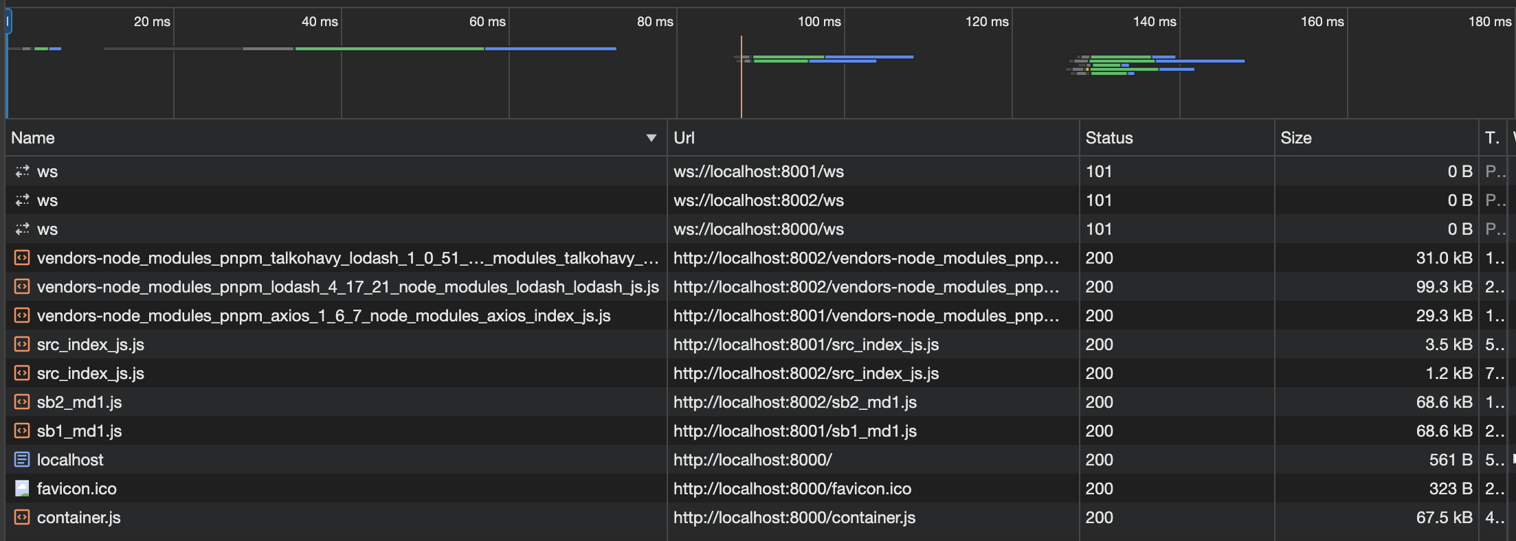
Consider that app-01 imports and makes use of the lodash library, and that app-02 does not use it.
In this case, if you were to open the network tab, you would see the following output:
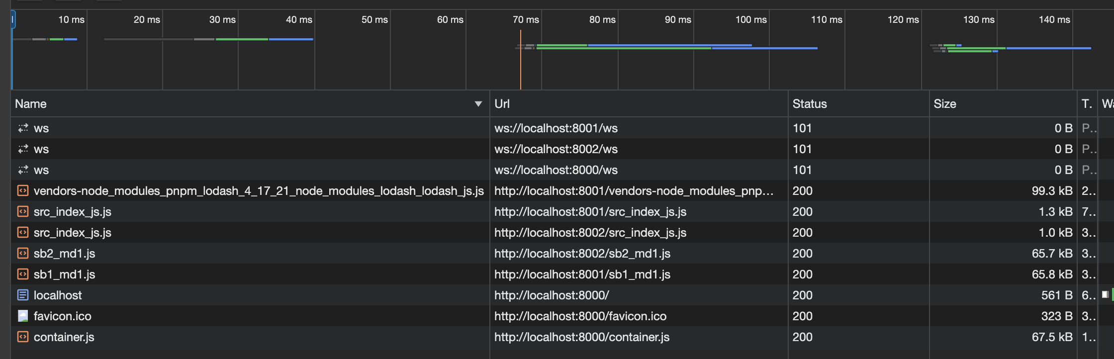
The lodash library is being loaded into the browser separately, and it weighs 99.3Kb.
Let's add another 3rd-party package to app-01, and see what happens. We will add 2 more packages: axios & @luckylove/lodash.
Here is the result:
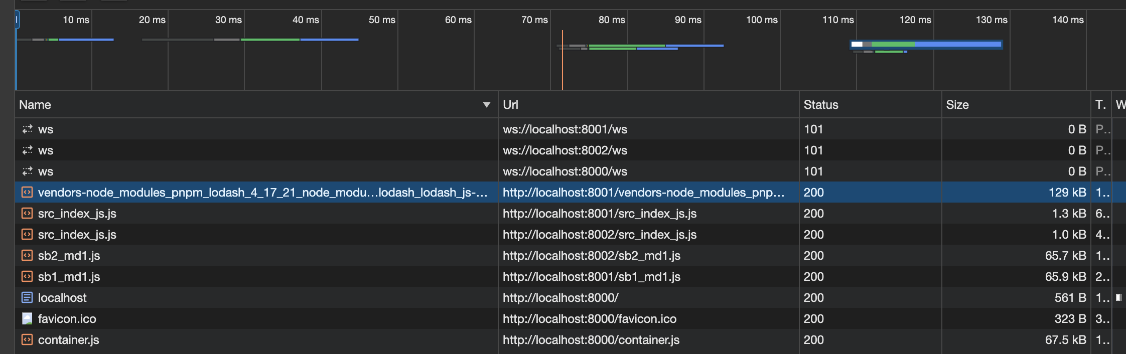
The bundle size went up to 129Kb, since it now contains more packages.
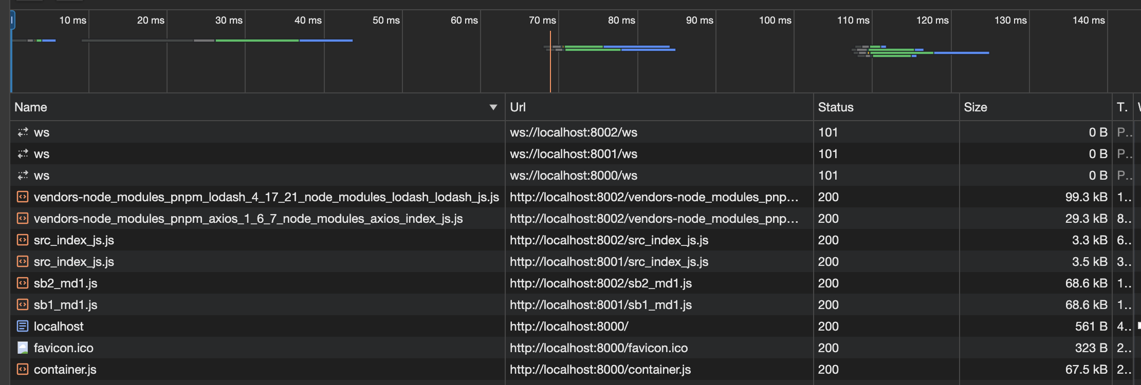
Now, consider that both app-01 & app-02 import those exact 3 packages.
Look at what happens in this case:
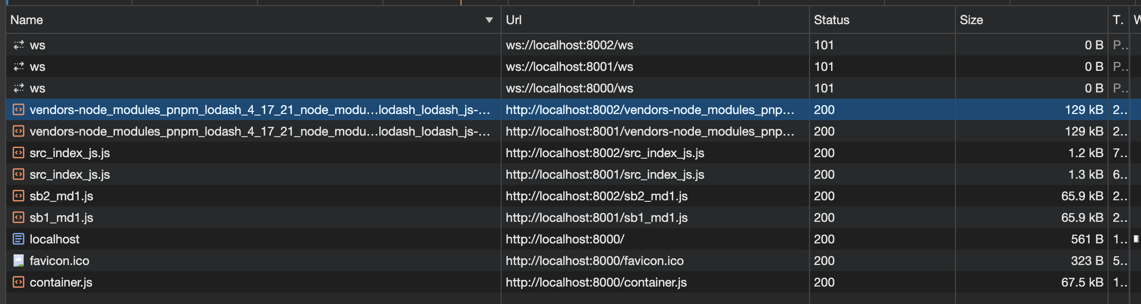
We see that same bundle being uploaded to the browser twice! This is bad practice that we'd like to avoid. So now what we're going to do is leverage webpack's shared ability. Let's start slow. Let's first include just the lodash library inside the shared. In both apps, inside their webpack's configuration, add the shared property, and type 'lodash' inside. After a refresh, the result should look like:
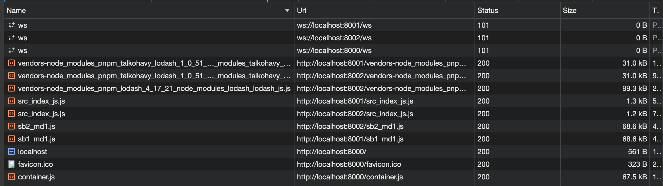
Now we see something interesting. The bundle size of both apps, which was 129Kb before, was now reduced to 31Kb, and a single bundle was added, which is exactly the weight of the lodash package, 99.3Kb, has been added. It's like lodash was extracted from both bundles, and been put into a single shared bundle, and is being loaded once.
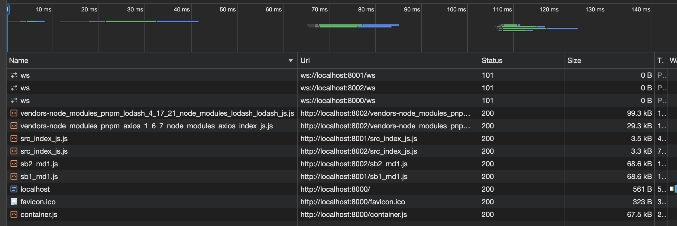
Let's now do the same for axios, but this time... let's share it in one but not the other. Inside the webpack config of app-01 i'm going to include axios, but in app-02 I am not.
Here is the result of doing that:
We immediately notice one big difference - only the bundle size of app-01 has decreased to 29.3Kb, while app-02 has remained the same with 31Kb.
But where did those ~2Kb difference go?
If you look closely, you'll notice that the size of src_index.js of app-01 has increase in exactly that amount! It was 1.3Kb before, and now it's 3.5Kb.
Adding both axios & lodash to the shared gives us the following result:
Both lodash and axios were put in a different bundle, lodash with 99.3Kb, and axios with 29.3Kb, where-as the size of @luckylove-lodash is spread twice, once upon src_index.js of app-01, and once upon that of app-02.
Finally, let's look at the result of exposing all 3 from both of them:
Here we see an interesting choice made by webpack. It appears to be that even though @talkohavy/lodash was included in the shared of both packages, webpack still decided to burden the load of that package twice, once on each package. My guess is that when that bundle size is so small, to trade off between the over head is in favor of having it twice (once for each project), than having to the extract it to a whole other file and import it from there.
9. Communication
Ways to communicate are:
- query params
10. Development Strategies With Frameworks
We will now try to use a framework library like react to build our micro-frontends and integrate them. We will see how we can use webpack with different technologies (React, Vue, and Angular).
We will implement the runtime integration using frontend technologies. We will create the conceptual foundation which you can later use with any frontend technology.